
How to Get Better Results From Generative AI: Visualise First
Guide · 13 November 2026 · Updated 20 November 2026 · 6 min read
In short
Better results from generative AI come from visualising the shot before you type, then naming it in the language of images: distance, angle, movement, lens, light, colour, texture and emotion. A model fills every vague word with the statistical average of everything it has seen, so precision, not a bigger model, is what removes the average.
Key takeaways
- Generative AI gives every vague word the statistical average of its training data, so precision is the only real defence.
- Picture the shot first: who is in it, where the camera is, how the light falls, what it sounds like, then describe it.
- Filmmakers already built the vocabulary for this; learning the terms gives you a control panel instead of a wish.
- Name colour precisely or attach a reference image. Words carry intent, references carry exactness.
- Write ten ideas before you prompt, then use the seventh. The first three are usually the average.
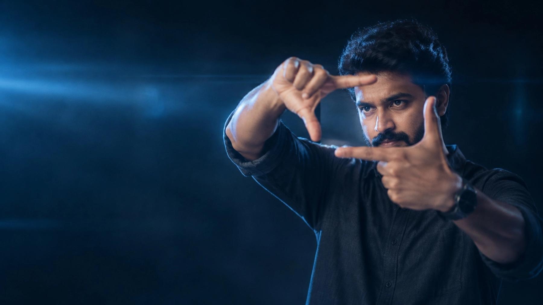
Better results from generative AI come from one habit: seeing the shot in your mind before you type, then describing it in the language of images. A model gives every vague word the statistical average of everything it has seen. The only defence against the average is precision, and precision starts in your imagination, not in a newer tool.
Why does generative AI keep giving you average results?
Every generative AI tool rewards one skill above all: seeing the result before you make it. Type "a beautiful woman smiling, cinematic" and you get the average of every image ever labelled that way: the average face, the average smile, the average grade, the average amount of background blur. Nothing in that sentence tells the model which woman, which smile or which light.
The tool is not being lazy. It is being obedient. "Cinematic" is not a description, it is a mood, and a mood has no camera position, no lens and no colour temperature. The model has no way to know you meant a low angle with a single hard window light and a long lens. So it reaches for the middle of the distribution, which is exactly where everything forgettable lives.
This is also why chasing a better model rarely fixes the problem. A stronger model gives you a sharper version of the average.
Visualise, then describe
The method at the heart of Prompt DOT AI is simple, and it runs in this order:
- Close your eyes and look at the shot. Who is in it? What are they doing? Where is the camera? How does the light fall? What colour is the world? What can you hear?
- Write down what you saw, in that order, before you write a single adjective.
- Only then open the tool and describe the shot you already have in your head.
Most weak prompts skip step one entirely. They open the box, type a list of adjectives and hope the model assembles a scene. Adjectives describe a picture. They cannot build one. The building happens in your head, and the prompt is only the transcript.
Why does "pink" give you the wrong pink?
When a client asks for "pink" for a wedding film, they might mean rani pink, a deep celebratory magenta, or a pale blush. Those are three different films. The model will choose the average and land somewhere nobody wanted, and the note that comes back is always the same: "not quite what we had in mind."
Name the colour precisely, and attach a reference image when colour, a face or a style matters. Words carry intent; references carry exactness. On a production job the reference image is not a shortcut, it is the sign-off: it is the thing the client and the colourist can both point at when the grade comes back.
What vocabulary do professional filmmakers use?
Directors, cinematographers and colourists have spent a century building a precise language for images. Learning it is the fastest route to better results, because every term is a control you can turn on purpose:
- Shot distance: extreme wide for isolation, wide for context, medium for conversation, close-up for emotion, extreme close-up for intensity.
- Angle: a low angle makes a character powerful, a high angle makes them small, a Dutch angle makes the world feel wrong.
- Movement: a slow push-in on a face says something is happening inside this person. A handheld drift says the world is unstable.
- Lens: a long lens compresses space and flatters a face, a wide lens up close distorts and exaggerates.
- Light: golden hour, blue hour, Rembrandt lighting, motivated light, 3200K warmth against 5600K daylight.
- Emotion: not just a smile, but which smile. A Duchenne smile reaches the eyes; a polite one does not.
What should every prompt name?
Before you generate an image or a video, check that your brief names all twelve of these:
- Subject: who or what, described specifically.
- Action: what they are doing at the moment of the frame.
- Setting: where, in enough detail to place a camera.
- Shot distance: wide, medium, close.
- Angle: eye level, low, high, Dutch.
- Movement: static, push in, track, handheld.
- Lens: wide, normal, long.
- Light: direction, quality and colour temperature.
- Colour: named, not gestured at.
- Texture: film grain, clean digital, soft skin, hard shadow.
- Emotion: the specific one, and how it shows on the face and body.
- Sound: for video, what the room sounds like, since audio shapes pacing.
Each one is a knob on the console. Leave it out and the model sets it to average.
A weak prompt against a complete brief. Here is "a beautiful woman smiling, cinematic" rewritten as an actual shot:
A woman in her early thirties sits at a kitchen table before sunrise, both hands around a cup she is not drinking from. Medium close-up, camera at eye level on the far side of the table, 50mm lens, static. The only light is a window at camera left, cool 5600K dawn, with a warm 3200K lamp out of frame behind her. She is not smiling, then she is, and it reaches her eyes. Faded cotton sari in rani pink. Soft grain, shallow focus, quiet room tone with one bird outside.
Read it back and notice two things. Every line answers a question the model would otherwise have answered with an average. And the word "cinematic" never appears. The shot is cinematic because the light, the lens and the framing are doing the work. That is the whole trade: you stop asking for a feeling and start specifying the thing that produces it.
How do you train visualisation?
Visualisation is not a talent you are born with. It behaves like a muscle, and it responds to short daily reps:
- Watch ten minutes of a film on mute each day and name every shot out loud: distance, angle, movement, light. Mute removes the dialogue crutch and forces you to read the image.
- Describe a real scene from memory, then compare your description with a photo of it. The gaps show you which details you do not actually see.
- Keep a personal lexicon of precise words for colour, light, texture and emotion. Twenty words you genuinely know beat two hundred you half remember.
- Write ten ideas before you prompt, and use the seventh. The first three are the average, the obvious and the one you saw last week. The seventh is usually yours.
Ten minutes a day for a month changes what you notice on set, in a cinema and on your own screen. The prompt gets better as a side effect.
What are the most common mistakes?
- Writing adjectives instead of shots. "Stunning, gorgeous, masterpiece" adds no information about the picture. Delete them and spend the words on light and lens.
- Stacking quality words. "4K, ultra detailed, award winning" is noise, not direction. It cannot stand in for a decision you have not made.
- Naming a mood without its cause. "Sad" is a feeling. A single cool window at camera left and a face turned away is a shot.
- Changing five variables at once. When you iterate, change one knob per generation, or you will never learn which change worked.
- Skipping the reference. For colour, faces and style, an image settles in one second what a paragraph argues about.
- Judging one output. The first generation is a draft of your own brief. If it is wrong, the brief is usually wrong in the same place.
How do you measure visualisation skill?
X DOT AI's free Creative Visualisation test at xdotai.in/ai-readiness measures this skill across six parts: imagery, visual vocabulary, spatial reasoning, precision, shot writing and lateral ideas. It returns a Creative Visualisation Index on an IQ-style scale, where 100 is the expected average, along with a creative signature: literal, lateral, technical or a blend.
That signature matters more than the number. A literal thinker needs to be told to push the framing. A lateral thinker needs to be told to nail the technical detail. Both can produce excellent work, and both waste months prompting against their own grain.
If you want to build this inside a team, AI training covers the method end to end, and AI films shows what it looks like when the brief is tight from the start. More breakdowns of prompts and production decisions sit in Insights.
Questions people ask
What is visualisation in AI prompting?
It is the habit of picturing the exact result before you write the prompt, then describing what you pictured in specific terms: subject, action, framing, lens, light, colour and emotion. It is the step most people skip, and it is the main difference between an average output and a usable one.
How do I stop my AI images looking generic?
Replace mood words with shot decisions. Name the lens, the direction and colour temperature of the light, the framing and the specific emotion, and attach a reference image where colour or a face matters. A model cannot guess a decision you have not made.
Do I need film vocabulary to get good results?
You need precise words, and film vocabulary happens to be the most developed set available, built over a century by directors and cinematographers. Learning twenty terms for light, lens, angle and movement gives you a control panel instead of a wish.
Can visualisation be learned, or is it a talent?
It is trainable. Watching ten minutes of film on mute and naming each shot, describing real scenes from memory, and keeping a small lexicon of precise words will change what you notice within weeks. The prompts improve as a side effect.
How do I keep a colour consistent across many generations?
Name the colour precisely rather than gesturing at it, attach a reference image, and reuse the same block of description every time instead of rewriting it from scratch. Consistency comes from a fixed brief, not from a lucky seed.
Does a longer prompt always get better results?
No. Specific beats long. Twelve unrelated adjectives add noise, while six deliberate choices about framing, lens, light and emotion remove it. Length only helps when every added line answers a question the model would otherwise answer with an average.
How do I know if my visualisation skill is improving?
Compare a brief you wrote a month ago with one you wrote today and check how many of the twelve elements you named without thinking. The [Creative Visualisation test](/ai-readiness) gives you a scored baseline and a creative signature to track against.